What is Color Theory? (The following information is from The Arty Teacher)

Color Theory is a collection of guidelines on the use of color for artists and it can really help any creative person make intelligent decisions when thinking about what colors to use in an artwork.
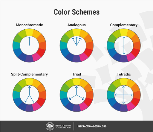
A 12-section color wheel can be used to help describe the relationship between different colors when they are viewed together. Artists use these color relationships to achieve different effects such as dramatic contrast or colors that are visually appealing together. Below are described some of the most common definitions used to describe these color relationships.

Complementary Colors – Colors that sit opposite each other on the color wheel. For example, purple and yellow. Complementary colors will contrast greatly.
Van Gogh used blues and oranges in his painting ‘Café Terrace on the Place du Forum, Arles’, 1888, below. Because he uses complementary colors the colors contrast and are vibrant.

Analogous Colors – Any three colors which are side by side on a 12-section color wheel, such as yellow-green, yellow, and yellow-orange.
Below, Claude Monet uses analogous colors in his tranquil painting ‘Water Lilies’, 1904. He mainly uses dark green, light green and yellow.

Split Complementary – A color and the two colors either side of the complementary color.
Triadic Colors – Three colors that are evenly spaced around the color wheel.
Monochromatic – Containing or using only one color.
The watercolor painting below, Stripes and Ceramics by Britanny Cartie is an excellent example of monochromatic painting as it uses only green. Also find Cartie on Instagram.
Color Temperature
Color temperature refers to the level of warmth contained within a color. Colors can be categorised as warm or cool. Warm and cool colors will contrast well with each other.
- Warm colors — such as red, yellow, and orange; evoke warmth because they remind us of things like the sun or fire.
- Cool colors — such as blue, green, and purple (violet); evoke a cool feeling because they remind us of things like water or grass.
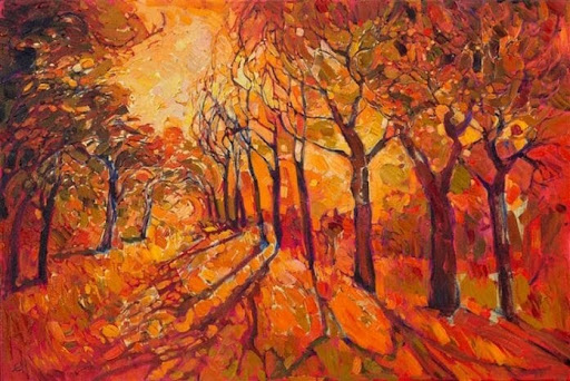
The painting below by Erin Hanson uses all warm colors. From dark brown, through every shade of orange and through a variety of yellows, it’s warm colors describe the landscape of the American west.
